
Redesigning The Basic Pattern Set: what I learned by almost getting it wrong

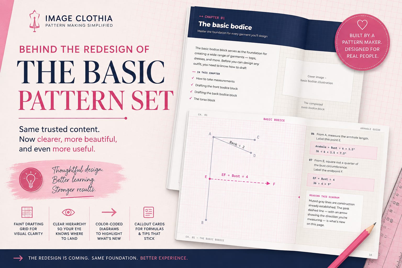
I’ve been deep in the redesign of The Basic Pattern Set for the past few weeks, and I wanted to pull back the curtain on the process, partly because a few of you have asked what’s taking so long, and partly because I think the mistakes I almost made are more useful to talk about than the parts that went smoothly.
Why redesign at all
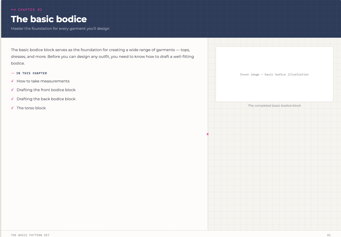
The current edition works. People use it, it sells, I still stand behind the content. But the layout was built years ago, before I had a real visual identity for Image Clothia, and it shows; plain black text, a diagram, a couple of lines of instruction, repeat. Functional, but it doesn’t feel like a system. It feels like 126 separate pages that happen to be in the same file.
So the goal for this edition was simple to say and much harder to do: keep everything that already works, the one-diagram-per-step pacing, the way each page builds on the last, and add the parts that were always missing. Color. Hierarchy. A reason for your eye to know where to land on a page before you’ve read a word of it.
A quick note before I get into it — I share the full behind-the-scenes on projects like this first in my weekly newsletter, before it ever makes it to Substack. If you want the earlier look next time (plus the stuff that doesn’t make it into a public post), subscribe here →.
The grid paper
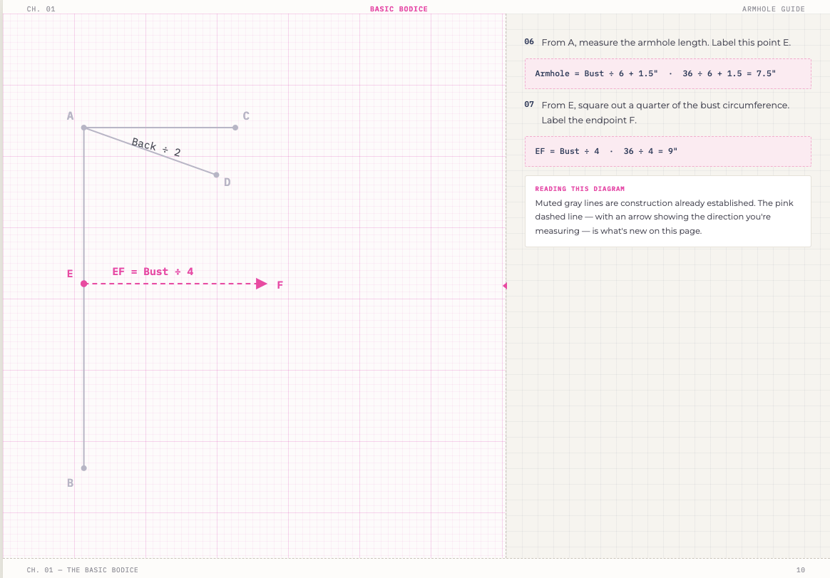
The first real decision I made was a small one that ended up mattering more than I expected: putting a faint drafting-paper grid behind every diagram.
It sounds obvious in hindsight, this is a pattern drafting book, and pattern drafting happens on graph paper. But it’s the kind of detail that’s easy to skip because it doesn’t feel necessary. It turned out to be the single thing that made the redesign feel like mine instead of a generic instructional layout. It shows up faintly behind every diagram, and nowhere near the body text, because, lesson learned the hard way, a grid behind paragraphs you’re trying to actually read just makes them harder to read. Texture behind a diagram is atmosphere. Texture behind a sentence is noise.
Borrowing a good idea, on purpose
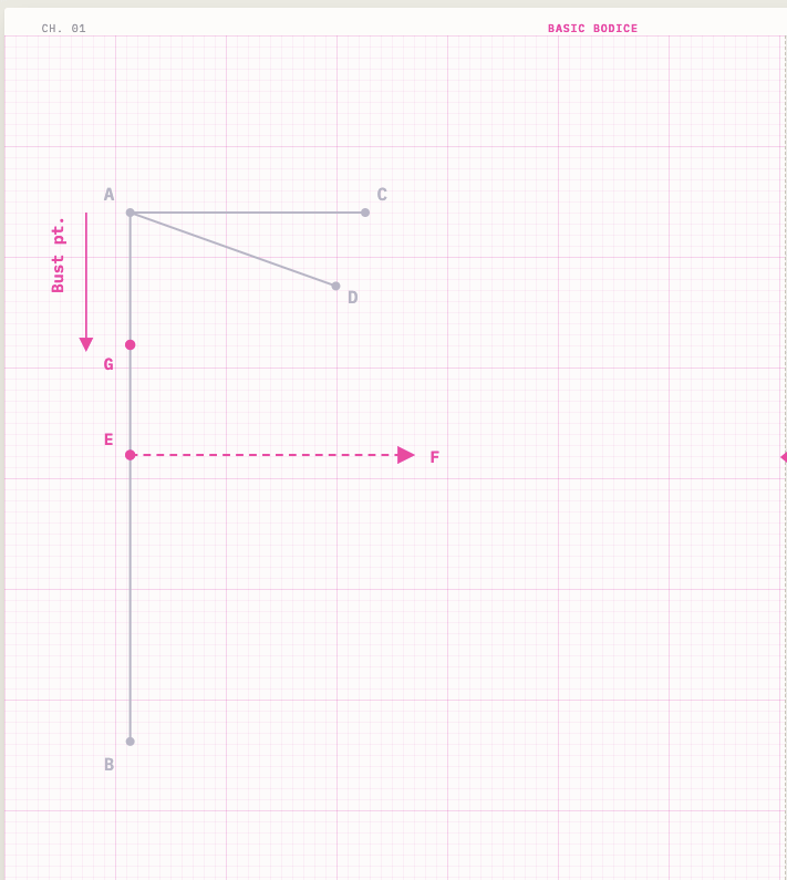
Partway through, I sat down with a pants-drafting book from another author I admire and really looked at how she handles her diagrams, the way she keeps old construction lines in gray and picks out only what’s new in color, with a little arrow showing which direction you’re actually measuring. I’d been doing something similar already (my current book uses a red dashed line for “this is new”), but seeing it done with that much intention made me tighten mine up: gray for what’s already there, pink for what’s new, an arrow so you never have to guess which way the tape measure goes.
There’s no shame in looking at what works elsewhere in your genre and asking “why does this work, and can I do it better in my own voice.” That’s just design. The instinct to keep it pink instead of just copying her palette is the part that keeps it mine.
Where I almost got it wrong
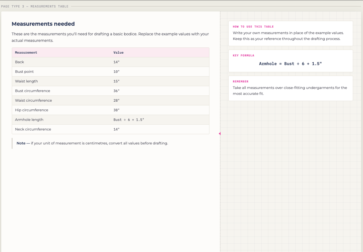
Here’s the part I actually want to talk about.
Partway through building the new layout, I got excited about the callout cards, the little boxes that pull out formulas and tips so they’re not just buried mid-paragraph. They freed up so much space on the page that I started wondering: could I fit two or three steps on a page instead of one, and cut the book down significantly?
I tried it. And it was awful. Not because the layout was bad, because it stopped teaching. Cramming steps together to save pages meant the “big reveal” moments, finishing a bodice block, completing a sleeve, got squeezed into the same tiny space as routine construction lines. The moment that’s supposed to feel like an accomplishment just... didn’t.
I scrapped it. Back to one idea, one page, exactly like the version that already works. The callout cards stayed, they’re still doing real work, just not the job I originally tried to give them. Sometimes the right call is to let a good idea be exactly as big as it needs to be, and not force it to solve a problem it was never meant to solve.
Where things stand
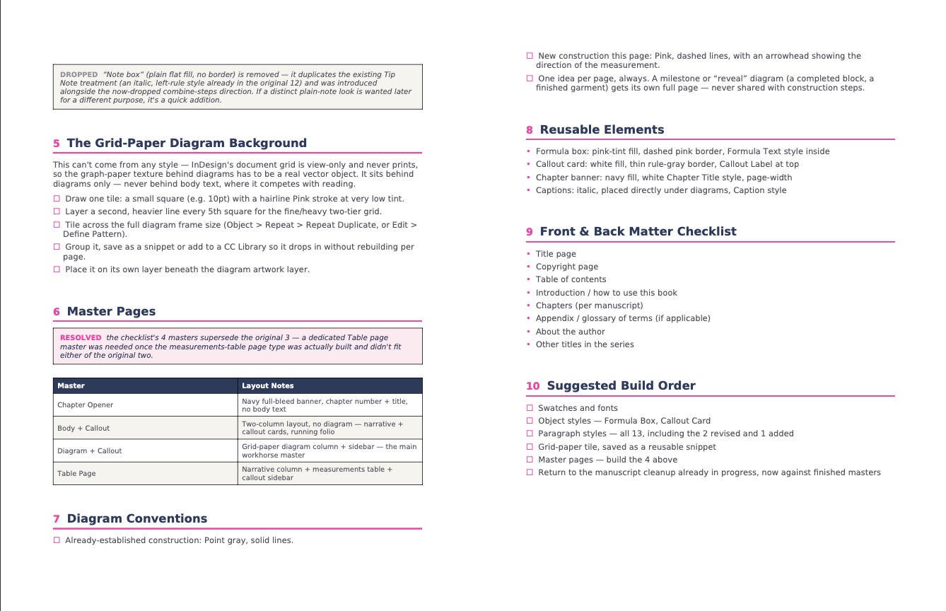
Right now I’m working through the actual InDesign build — styles, colors, the diagram grid, page by page — so the next update won’t be about the idea of the redesign anymore, it’ll be actual pages. I’ll share some of those here before the new edition goes anywhere near a “buy now” button.
If you’ve ever redesigned something you’d already shipped once; a pattern, a course, a book, I’d love to hear how you knew when a change was actually making things better versus just making things different. That’s the question I keep coming back to.
This is the short version. Every week I send a newsletter with the fuller story on what I’m building; pattern drafting deep-dives, early looks at new releases, and the stuff that doesn’t fit in a public post. If that sounds like your kind of thing, come subscribe → — it’s free, and it’s where I show up first.
💡 Get it now, before the price goes up.
The current edition of The Basic Pattern Set is still available at today’s price — but once the update launches, the price increases. If you buy now, you’ll get the current edition today and the updated edition free when it’s ready, no extra payment.
Buy the PDF (this option supports my work directly, more of it goes toward creating resources like this)
Already own it? You’re covered, the update lands in your inbox free, automatically.
White space matters.
Speaking as a former instructional designer/developer, I LOVED this post. How information is presented is absolutely key. Thank you for breaking it down.